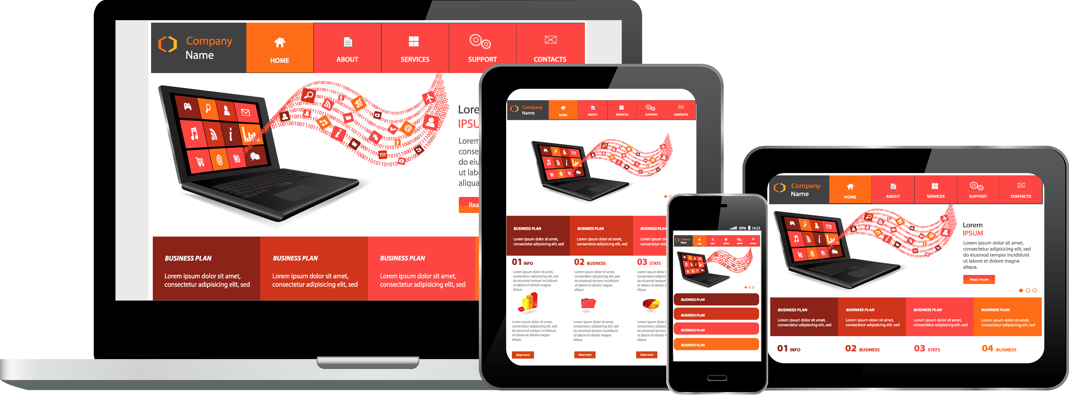
At first, you could only browse the Internet on desktops and laptops, that is, you had to have a computer to search for, or visit a website. However, Smartphone and tablets changed all that. Now it is possible to go online and check out anything you want on the Internet through your phone or tablet or Phablet – whichever device you may have. What responsive web design does is; it allows you to view web pages according to the size of the screen or browser that you are using. So, you can view a single website from any device – be it a desktop or a laptop or any size of Smartphone or tablet. If you have a business, a website is a must, and in today’s world, that website needs to be responsive. Most of the major cities in the world offer services of doing responsive web design Melbourne, New York or London or India– and nowadays even smaller places offer these services.
What does Responsive Web Design Entail?
The practice of responsive web design comprises using a mix of flexible grids and layouts, images along with a smart way of using CSS media queries. As you, the user go from your laptop to your tablet, the website should automatically change the resolution, size of the images, and the scripting abilities. To put it in a different way, the website should be capable of automatically responding to the preferences of the user. This removes the need to design a separate website for each new gadget that might become available on the market tomorrow.

Techniques of Responsive Web Design
While staying in Melbourne, if you are not able to design it yourself, can always choose a company that guarantees a responsive web design, Melbourne. All you need to do while availing their services is to, keep a few factors in mind:
Screen Resolution: Each device has a different screen resolution, definition, and orientation. Some have more height; some have more width, while others are a perfect square. You can also rotate the screen from portrait to landscape and the website orientation should change accordingly. A partial solution is to make the layout totally flexible. You use a mix of fluid grids, fluid images, and smart markup as you need them.
Flexible Images: Images are a big problem when it comes to designing responsive websites. One of the most popular ways of resizing images proportionately is to use a CSS element: max-width. You set the maximum width of the image to 100% of the width of the browser or screen so that when that 100% becomes narrow, the images become narrow as well.
Custom Layout Structure: You need to use a separate stylesheet or a CSS media query for major changes in the size.
Show or Hide Content: Even though you can shrink everything to make it fit on a smaller screen, it might make your page look very cramped or hamper readability. So you can decide what content you need to display on a mobile device and use some techniques like simpler navigation or crisp content or a list of rows instead of many columns.
A new era of web design and development is being ushered in. Responsive web design helps improve the user experience. In the city of Melbourne, today, there are multiple companies that are experts in providing such services. So, what are you waiting for? Opt for a company that provides responsive web design, Melbourne or make sure that you are building a website that has a responsive design for your customers’ benefit that will ultimately benefit your company and its online presence.